
Bounties are one of the most important aspects of Just About, amd we need to ensure that they are the best they can be in every regard. That doesn't just mean coming up with fun bounty ideas, but also ensuring that your experience of entering them is smooth and joyful. So - with huge thanks to Tom and our tech team - we've given them a bit of an overhaul.
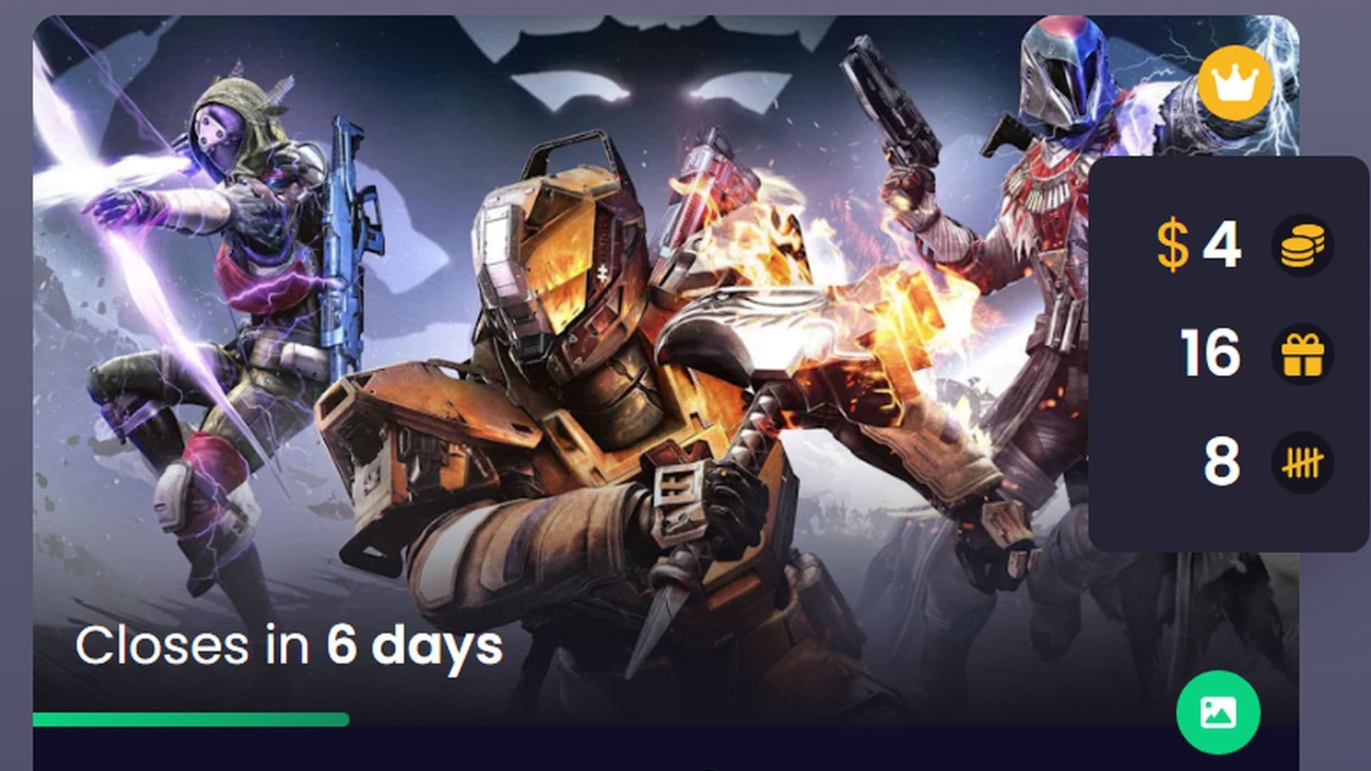
Presenting the new bounty interface on the left, vs the old on the right:
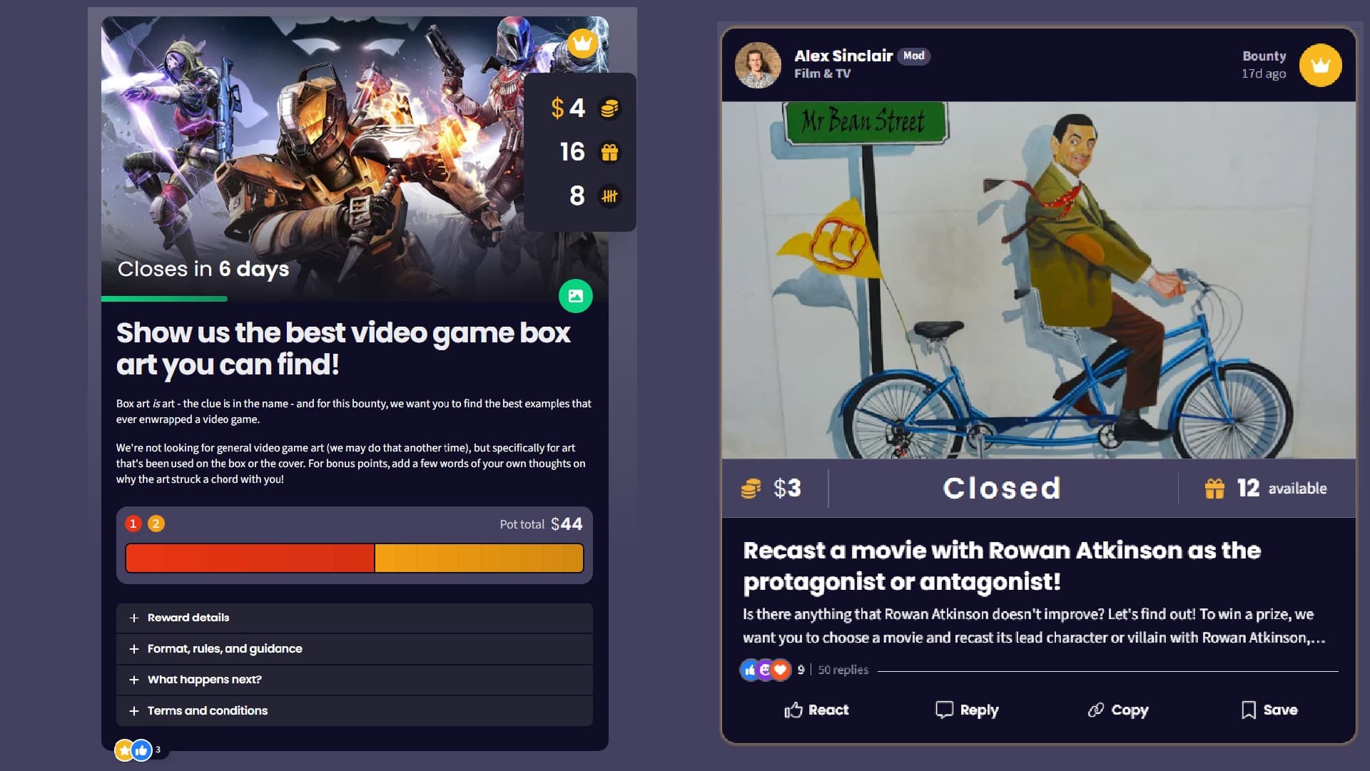
We think you’ll agree the new designs are much cleaner. The topline information - the number and size of rewards, plus icons showing the submission format - is all clearly visible around the header image (which now has a handsome shadowing effect, too).
You'll remember that when you clicked into the old one, all the terms and conditions and so on would unfold all at once. Now, the unique task description is the only information displayed, while those other details - which vary less from bounty to bounty - can be filed neatly away in collapsible accordions, saving your scroll wheel and getting you into the submissions quicker.
Only one word of caution: please don't forget to check the reward details and format guidance! These points do vary, and if you, say, submit an image without doing so via connected social media on a bounty that requires it, you'll miss out on your rewards.
Now that that's out of the way, this thread (or the usual feedback thread) is now the place to tell us what you think of these new designs. What do you like or not like? Have they made your experience of submitting to bounties that precious bit more joyful?
Created at . Page last updated at .